Monday, August 30, 2010

Pencil Tool Fun Time!

Hey folks,

So last night I was playing Scott Pilgrim Vs. The World: The Game on Xbox 360, which is pretty fun and worth the $10 asking price. My favorite aspect of the game is its beautifully-illustrated character sprites, showcased in a fun style indicative of the comic but its very own thing at the same time. The artwork inspired me to go into Photoshop and build my own pixel character. The result was only okay (straight-up pixel art is not one of my strong suits) but I can't show it to you because it's one of the "date" characters from Yoki Safari, and I'm not prepared to reveal any of those guys just yet. ;D

But the effort was not totally pointless. I sat back down after playing some more of the game with a friend and half-heartedly fiddled around with the pencil tool even more, and found that it makes inking infinitely more easy and quick, and looks fantastic! Because of the anti-aliased nature of the lines, coloring is also a million times simpler.

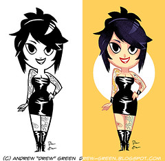
The first result was a fun doodle of a tattooed girl:

Chibi tattoo chick

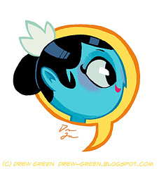
Second, I did a fun picture of Charlie Dubai's head in a talk bubble:

Charlie's head in a bubble

Then I did this freaky picture of some evil chick. I don't much care for it, it's kind of awful, but here you go anyway:

Evil chick doodle

That's a lie. I like the shines in her hair, I guess.

More things to come, soon. I'm going to continue experimenting with the pencil tool and see what kind of benefits I can get from it.

Take care,

~Drew

Sunday, August 22, 2010

Maria Grind and Yoki Safari

Hey folks!

Lately, I've been a little lacking in the updates realm, for which I apologize. I have been working on a freelance gig that has proven to be quite hefty in the workload department, and it has left basically no time for drawing the things that I want to draw. That is the way it works, I guess.

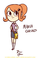
But! I have a concept sketch for a character from "The Duncan Button." Her name is Maria Grind, and she is Ridley Duncan's good friend (and love interest).

Maria Grind concept

She is an avid RPG fan, hence the last name, and a bit of a Japanophile, but has a good head on her shoulders. This was drawn a little while ago, dunno why it took me so long to get it online. There are a couple things I can see right now that I want to change about the design, but such is the nature of an initial concept sketch.

Also, did a sketch of Yoki Safari, trying to nail down the look I want for her, getting very close:

Yoki, August 2010 sketch

And what's that? The return of the swirly swoosh in her hair? Le gasp! Only time will tell if it stays...

Anyway, I should be back to drawing regularly again in a week or two, and again, I apologize for the silence.

Take care, folks!

~Drew

Sunday, August 8, 2010

Color Holds In Illustrator Are Tough...

Hey folks!

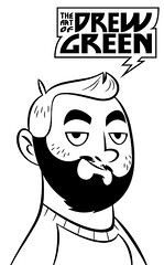
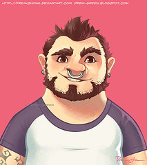
Just wanted to blow my own horn. I threw together a new ID for Deviantart, because I wanted one to reflect my current beardiness. Here are the inks:

DA ID August 2010 - inks

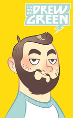
And the fully-colored version:

DA ID August 2010 - colored

Take a look at where the beard meets the hair, in both versions. In Illustrator CS, making colored lines - or "color holds," as I believe I've heard them referred previously - is a bit more of a challenge than it is in, say, Photoshop. It requires some patience, forethought, and in many ways, a "well, looks like you're gonna have to do that all over again, because you messed up, buddy! mindset. It's Satisfying, but tricky.

Imagine throwing a gradient into that. That complicates things a little bit.

So look at and appreciate the beard-to-hair transition. Because it was hard. Yes, I would love some cheese to go with my whine.

Take care,

~Drew

Sunday, August 1, 2010

Charlie Dubai Vs. Magnus Mayhem

Hey folks!

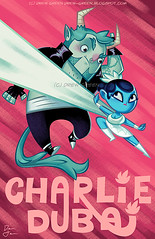
Started on this one last night (sketched in Photoshop, inked in Illustrator) and colored it (Photoshop) today. It's a promotional piece for my comic, "Charlie Dubai," and once I get my Etsy shop up and running again, this will be featured as a print (signed, of course).

Charlie Dubai Vs Magnus Mayhem

Last night as I became extremely tired after working on this, I watched some "Samurai Jack" on DVD to wind down. I actually hadn't really appreciated the show when it was on the air. My mind was in a different place, and my tastes were less-refined. I didn't "get" it. But now I do. Let's toss aside the fact that the storytelling in each show is super-tight and very compelling, and examine that every single shot in that cartoon is an absolute work of art. Never have I seen a style so honed and delicious, full of nuances but simple enough to digest without any problems. Characters are flat and bold in color and line, not a single one poorly-designed or not compelling, and backgrounds are beautifully textured and wonderfully stylized. Mr. Tartakovsky didn't create a cartoon, he created a visual masterpiece.

I only mention it because I think it directly informed the way I colored this. I've been working hard to make some more traditional-looking brushes in Photoshop, to decent results. I would not compare my art to anything seen on that show, but I can say that it has inspired me to work harder at a certain look.

Anyway, enjoy the art! I'll let you know when it and other pieces go on sale!

~Drew

Wednesday, July 28, 2010

Largest Nosering Ever Version 2

Hey folks!

Here, have a new version of one of my older, all-vector works:

Largest nosering Ever V2

I've been on a bit of a Photoshop kick lately. I think it has been good for me to give the vectors a bit of a rest, letting my hand do all the work again instead of the mouse. Mind, I sketch in Photoshop, but I often produce the finished image in Illustrator, which is a great program but so technical that sometimes it can be creatively stifling.

One thing I have a really hard time with where digital painting is concerned is line art. I dunno what it is, perhaps I have a shaky, unsteady hand, but I just cannot seem to get the nice, crisp results some people can inking in programs like Photoshop (which, frankly, isn't the best program for inking anyway). So I exported the inks of one of my previous images as a Photoshop doc and decided to paint it. You can see the all-vector version here.

You know, I take pride in my ability to make Illustrator do some pretty neat things, and I really like the original version of this image, but...I think I like this one better! I think it has a little more life to it, some of the color choices are better (I always hated my decision to go with that macaroni yellow background, but nothing else seemed to work).

I would love your feedback!

Enjoy!

~Drew

Inks: Adobe Illustrator CS. Colors: Photoshop CS.

Tuesday, July 27, 2010

Caricatures yay!

Hey folks!

So, the other night, I got a little bored and yet somehow simultaneously inspired, so I decided to fill my free time (and then some) with some art. This was the result:

Caricatures_colored and collected

These are caricatures of people I am friends with on facebook! Some of them I know in real life, some of them I do not, but all of them were a lot of fun to draw. Here, have some blurby hotness about each one.

-Will: I have drawn this fellow before, but I didn't feel like the likeness was quite...there. I know it's hard for you guys to know without a comparison, but I think this one looks more like him, I think. He is in fancy opera-singing attire. Or at least that's what I assume, considering the reference photo I used.

-Tim: I don't know Tim that well, but he seems like a cool guy. And frankly, with those awesome tattoos and the epic sunglasses and mustache, how could I possibly resist? His tattoos are not entirely accurate, but it's the essence that counts the most when drawing in a cartoony style, and don't you forget it, kids!

-Matt: The most interesting thing about this particular caricature is that it wouldn't (and didn't) look a thing like Matt without his lightly-colored eyes. It's amazing how something so small can make such an enormous difference! Oh, and a word to Matt: cheer up, cheeseburger, it's not all so bad.

-Katie: She's a long-time friend of mine, I had no choice! Actually, that's not why I drew her. I did so because I've never drawn a picture of her that looked anything like her, and it was about time I did. I think it's successful, though I'd be remiss if I didn't mention that she looks like a Scott Pilgrim character here. ;D

-Wes: My father's best friend, he has known me since I was very very young. This ones stands out in that I think it looks the most like the person it's supposed to be (hard for you to know, I know, no point of reference). I don't know how it happened, but when drawing Wes, he just poured out of hands and onto the digital canvas, it was amazing! I hope he agrees...

-Jen: Wes's wife and all-around cool gal, why would I not want to draw her? I fear her hair is a little big here, and maybe not long enough...but I tried. Your facebook photos are dark, Jen! By the way, if you had photos of yourself with your new vintage-styled hair, I would have included that. For shame, Jen, for shame.

-Tara: Tara's pretty awesome. From my admittedly limited time knowing her so far, I can already tell that Tara is an adventurous, smart lady with a "glass-half-full" attitude and a lot of interesting things to say. You can read those interesting things at her blog, Sylace Says Yes (hence the "YES!" word balloon). I highly recommend you give her a read!

GUYS! I could totally write an animated/comic book sitcom and use you as the cast of that sitcom! I love how these came out!

Frankly, my favorite part about this little project was just how challenging it was to capture the likenesses and essences of these people, and how rewarding it was when I finally felt like I did. I'm so used to drawing things from my head, and in many ways that can be easier because I'm in control. But when you draw real people, you have to be faithful to whom they really are or you run the risk of disrespecting their being. I hope you guys feel like I did you justice!

And if you don't, well...these were unsolicited, free commissions, so stop bitching.

Take care!

~Drew

PS: Don't feel bad if you were not included this time around. I enjoyed doing this so much that I wouldn't be surprised to find myself doing it again in the near future, and naturally I'll need a whole host of new subjects. ;D

Sunday, July 25, 2010

Art Thoughts - Urban and Vector Art

Hey folks!

Sometimes, I have random thoughts and ideas about art itself. And since this is an art blog, and not simply a "sketch blog," I think it's okay if I share them here (I wouldn't be surprised if I post this on my DA gallery as a journal, too, as I know I will get some feedback there). I would like to share my thoughts a little more often, instead of just rehashing images I post elsewhere, to you.

Anyway...

I was perusing DeviantART, looking for various groups that cater to the kind of art I do so that I might more-efficiently whore myself out to the masses. And I came across a group focused on vector art. Okay, fair enough, nothing strange going on here. But it's what they requested members submit to the galleries that struck me as a little surprising.

Things the owner of the group did not want to see submitted for review were realistic vector portraits and vector traces of photographs. Things the owner did want to see included actual illustrations, but I remember the guidelines mentioned a particular proclivity toward "urban" art.

For those not in the know, the "urban" style often features spatters of paint (usually meant to emulate spray paint), graffiti, cute and funny monsters, and hip-hop or pop culture references. This isn't always what urban art is, but a lot of it does fall pray to these trappings.

I mention this because what fascinates me is that it wasn't until this moment that I realized, a large portion of what's being done in the vector scene right now is "urban." And it got me wondering why. My guess is perhaps that a lot of people who are formally trained in vector art programs have an academic background in graphic design, and many elements of urban art are very similar to those found in graphic design. Look at some urban art, and you'll see there's a lot of focus on unique typography, placement, color choices, patterns, etc. I mean, of course other forms of art incorporate those things (lord knows I do with my cartoony style), but it's all law in graphic design, and almost by association, urban art. I also find a lot of the graphic design crowd tends to have a somewhat "trendy" set of tastes, which also really caters to the sensibilities of urban art.

But then, that doesn't really make a case for the enormous amount of (often gorgeous, though creatively lacking) realistic portraits done in vector mediums. What about that form of art attracts so many vector artists? I have only ever started two realistic vector portraits, and gave up because the process just wasn't something that kept me interested enough to want to continue. The payoff was slow, and ultimately not something that came from me but rather, a photographer. What's the point? Why vector it when it's already there, represented beautifully in pixels, ready to be enjoyed?

I think it has a lot to do with the challenge, honestly. I know many people that do these realistic vector portraits, for instance, really like to eyeball the colors instead of use the color picker, and perhaps they learn more about how to use tools like the Pen Tool and gradients. I like to hope realistic vector portrait artists are doing it mostly because they hope to learn and apply the experience to other, more user-created styles of art.

Or maybe I'm just a snob. Who knows.

Anyway, that's enough from me for tonight. I hope I didn't bore you to sleep, tears, or suicide.

Take care!

~Drew